Showing posts with label graphic design. Show all posts

Friday, 11 February 2011

"Rock Box" Track of the Day: Neil Richardson, "The Riviera Affair"

Ocean's thirteen? What's he doing for his thirteenth birthday? Have his pubes shown up yet?
Song: "The Riviera Affair" by Neil Richardson
Released: 1970
Why's it part of the "Rock Box" playlist?: When I first saw Ocean's Thirteen, I dug the old-sounding Warner Bros./Village Roadshow logo music.


I wasn't aware that the logo graphics and music were a reference to '70s and '80s TV, in keeping with the film's nostalgia for things like '60s and '70s caper flicks and the camaraderie of the Rat Packers who starred in the original version of Ocean's Eleven (as heard in "You shook Sinatra's hand," the film's frequently repeated line to Al Pacino's villainous character about how much of a backstabbing asshole he's become). I didn't grow up in New York, so I learned on YouTube that the swanky Ocean's Thirteen logo music--"The Riviera Affair," a library music cue written by British composer Neil Richardson, who died in October at the age of 80--was the same instrumental that used to open and close the "4 O'Clock Movie" broadcasts on New York's WOR.


Steven Soderbergh's shout-out to the WOR movie broadcast graphics is the director's way of saying, "Ocean's Thirteen is just like those old, breezy caper flicks that used to turn up at 4:00 on WOR."

Neil Richardson (1930-2010)
Richardson's instrumental was left off the Ocean's Thirteen soundtrack album, but it's part of 1996's Sound Gallery '60s and '70s library music instrumental compilation. An Amazon.com user review of The Sound Gallery sums up "The Riviera Affair" well. "Picture David Janssen and Diana Rigg cruising in a turquoise convertible along the open highway with the wind in their hair and the glorious possibilities of the future before them," says the reviewer. "This will give you just a small idea of how glorious and transcendent this tune is!!"

True, although when I hear "The Riviera Affair" and picture nearly the same thing--a relaxed playa cruising in a turquoise convertible along the open highway with his woman by his side--the twitchy star of the original Fugitive TV series doesn't exactly come to mind.

In 2009, another one of Richardson's loungy library music instrumentals was used to great effect when director Michel Hazanavicius gave ample screen time to Richardson's "Rio Magic" in the French spy spoof sequel OSS 117: Lost In Rio.

All the other "Rock Box" Tracks of the Day from this week:
Iggy and the Stooges, "Search and Destroy"
Raekwon feat. Inspectah Deck, Ghostface Killah and GZA, "Guillotine (Swordz)"
Dinah Washington, "This Bitter Earth"
Earth, Wind & Fire, "Reasons"

Thursday, 13 January 2011

"Rock Box" Track of the Day: Stevie Wonder, "I Believe (When I Fall in Love It Will Be Forever)"

They forgot to add Most Valuable Player to Kathy Nelson's on-screen credit.
Song: "I Believe (When I Fall in Love It Will Be Forever)" by Stevie Wonder
Released: 1972
Why's it part of the "Rock Box" playlist?: It's featured in High Fidelity, which was where I first heard this overlooked Wonder tune.
Which moment in High Fidelity does it appear?: The closing credits, which are a special treat for fontophiles like myself. Mmm, Stencil...

About a Boy, another great Nick Hornby adaptation from the early '00s, attempted to do for Skechers what High Fidelity did for The Beta Band.
Mmm, Eurostile...

Euro my steez.
The characters' hatred of Wonder's '80s and '90s output was the subject of one of Jack Black's key scenes ("Rob, 'Top Five Musical Crimes Perpetrated by Stevie Wonder in the '80s and '90s.' Go."), so it's no surprise that Rob (John Cusack) opted for 1972's "I Believe" while making a mixtape for Laura (Iben Hjejle). "I Believe" is the closing track on Wonder's Talking Book album. In 2005's 1001 Albums You Must Hear Before You Die, Stevie Chick wrote that "'I Believe' finds Stevie's heart broken, but his belief in love still intact"--much like Rob at the end of the film.

Hear Stevie pick himself up, dust himself off and start all over again while the High Fidelity closing credits display many different kinds of awesome band flyer-inspired typography at The Art of the Title Sequence.

Wednesday, 28 April 2010

And my soul has been Geocities-ized

Comic Sans: the Chevy Vega of fonts
A Fistful of Soundtracks: The Blog gets put through the Geocities-izer.

If Twitter existed back in 1996, then I would have been able to live-tweet Empire Records first-run instead of over a decade later on DVD, and this is what the live-tweet would have looked like. The eloquent word that could best describe the way it would have looked is 'shitty.'
Renee Zellweger is traumatized by the ugly site design.

Yeah, when I think A Fistful of Soundtracks, the first thing that comes to mind is the 7-Up dot.
Nothing says late '90s like the Dancing Abortion in a Diaper.

[Via the Geocities-izer (via Krishna M. Sadasivam)]

Tuesday, 6 April 2010

Alternate Posterama 2: Electric Boogaloo

Inglourious Basterds by David Choe
Inglourious Basterds by David Choe.

Inglourious Basterds by Estevan Oriol
Basterds by photographer Estevan Oriol (the Choe and Oriol posters were part of a Basterds-inspired art show that raised money for Haiti earthquake relief at L.A.'s Upper Playground Art Gallery).

Arrested Development vs. Star Wars
Arrested Development/Star Wars mash-up. [Via The Live Feed]

Mythbusters vs. 007
Mythbusters/007 mash-up. [Via The Live Feed]

Antichrist vs. Fantastic Mr. Fox
Antichrist/Fantastic Mr. Fox mash-up by SamsMyth.

'Oh no! Not the tape! Not the tape! Aaaaahhhhh! Oh, my eyes! My eyes! Aaaahhhhh! Aaaaagghhh!'
Bad Lieutenant: Port of Call New Orleans by Alan Hynes. [Via Super Punch]

'I'll give you mook!'
Mean Streets by Raid71.

'I'd paint three of those murals for some of that ass.'
Wild Style by The Fat Beicon.

Alphaville by arrangement
Alphaville by arrangement.

'You look like a radioactive tampon.'
Moon by marcos c.

'Atlanta? You can't be serious! That's Siberia with mint juleps!'
One, Two, Three by marcos c.

'You never learned to mind your surroundings!'
Batman Begins by TheMadmind.

Friday, 2 April 2010

Alternate movie posterama

Dark City by Kevin Wada
Another alternate movie poster that's nicer-looking than the original: Kevin Wada's retro Dark City poster, which emphasizes the Strangers, the film's creepy adversaries. [Via Super Punch]

Whitewashed Better Luck Tomorrow by You Offend Me You Offend My Family
The You Offend Me You Offend My Family blog sticks it to Hollywood's tendency to whitewash movies based on source material in which Asians played a central role by whitewashing Better Luck Tomorrow, which starred You Offend Me bloggers Roger Fan and Sung Kang and was directed by their fellow You Offend Me team member Justin Lin. [Via You Offend Me]

Dr. T & the Women II by a Fark.com contributor
A Fark.com "unneeded sequel" entry that imagines a second Dr. T & the Women movie. [Via Super Punch]

Seven Samurai by Grinning-Oni
Seven Samurai by Grinning-Oni.

'Kara Thrace will lead the human race to its end.'
Brandon Schaefer's poster for an advance theatrical screening of the made-for-DVD Battlestar Galactica: Razor in 2007.

Predator by Made by Mat
Predator by Made by Mat. (Wow, that Predators trailer actually doesn't suck. I love how Danny Trejo, Cletus Van Damme and a yakuza are among the human predators. But what's Eric Forman doing in the cast? One of these things is not like the other.) [Via Super Punch]

The Birds by Laz Marquez
The Birds by Laz Marquez. [Via /Film]

Thursday, 11 March 2010

From hell

I'd love to hear what Paul Mooney would have to say about a TV studio logo that scared millions of white folks shitless.
Like Sam Rockwell during a memorable moment in one of my favorite movies from last year, the indie sci-fi flick Moon, I've been checking out some Bewitched reruns lately (damn, sitcoms are so much better written and produced nowadays than they were in the '60s, thanks to showrunners who have smartened up and realized the canned laughter that filled Bewitched and countless other single-camera sitcoms is so lame and annoying). Bewitched reruns conclude with a certain TV studio logo jingle that's the subject of an amusing mockumentary short, "The S from Hell," which I stumbled into on Scrubbles.net. The short was made by music video director and Ping Pong Playa storyboard artist Rodney Ascher, who screened it at Sundance earlier this year. The jingle that scarred for life the littlest viewers of Screen Gems productions like Bewitched and I Dream of Jeannie was composed by Eric Siday in 1965.

Any person who shits their pants because of a logo jingle is a wuss. The mockumentary pokes fun at that wussiness by interspersing soundbites of actual interviewees discussing their phobia of Siday's logo music with silly footage of a giant S from Hell chasing a little girl (the French-made "Logorama," which nabbed a Best Animated Short trophy at the Oscars earlier this week, also unleashes the evil side of another corporate logo that's known for creeping out kids--Ronald McDonald).

The synthesized jingle for the Screen Gems and mid-'70s Columbia Pictures Television logos is scary? It's not scary. It's just weird-sounding, like that Dominic Frontiere-penned '60s Paramount Television logo jingle known as "The Closet Killer," which sounds less like a fanfare for a stately mountain and more like music for a scene in which a man discovers his wangus has just been chopped off.

These days, the Screen Gems logo opens the Resident Evil flicks and movies like First Sunday and Armored, which are targeted to young black moviegoers who would laugh their asses off if they found out the Screen Gems logo used to give white kids nightmares.

Tuesday, 8 September 2009

Font memories

Font memories
As part of his transition to HD last week, Craig Ferguson finally updated his show's opening title sequence, which used to be such a creaky-looking, misleading opening sequence (it made it look like The Late Late Show was all sketch comedy, when the sketches really only comprise two percent of the show--that's like if SNL opened with credits that consisted of nothing but shots of Seth Meyers reading the fake news).

The Late Late Show logo also experienced a makeover, which has been lesser-liked than the spiffy new opening ("The old logo was fun and distinctive, but the new one is somewhat bland"), while fontophiles have been more harsh towards the Ikea catalog's font switch from Futura to Verdana, according to a Gray Lady article that letterer Janice Chiang forwarded me. Branding is everything, which is why my picky self has constantly changed my radio station's textual logo over the years. I first used the Fistful of Soundtracks logo on flyers I made for AFOS the college radio program and then placed it on the AFOS sites, the covers of CD copies of episodes I burned for friends and the Microsoft Word files of the home-recorded program's episode scripts. Like what TrekMovie.com did in March with the many different Star Trek opening title fonts from 1966 to 2009, here's a brief history of AFOS fonts.

1997 A Fistful of Soundtracks logo
1997-1999: I wanted a dope font that both screamed "spaghetti western" and looked like something that came from poster art for a '60s or '70s European movie that was scored by Ennio Morricone, whose non-Sergio Leone '60s and '70s scores were among the scores I was discovering for the first time on CD back in 1997. I found that kind of font in Wharmby. I liked how it resembled the Morricone-scored Untouchables opening titles. Of course, after a couple of years, I get tired of the same old thing, so...
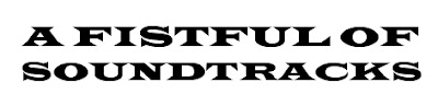
1999 A Fistful of Soundtracks logo
1999-2000: I chose another font that I thought screamed "spaghetti western," Wide Latin. Graphic designer Matt Hinrichs of Scrubbles.net used Wide Latin for the previous incarnation of his blog's logo. This was the first logo I featured on the program's then-new site. I forgot Wide Latin was the same font that was used in the Kung Fu opening credits. I didn't want anything to do with a font that, to me, represented an annoying show that starred yet another white guy who tried to pass himself off as Asian (I know PopeyePete loves that show, but I have issues with it), so...

2000 A Fistful of Soundtracks logo
2000-2001: At the time, I was crazy about the italicized opening title fonts from the Pierce Brosnan 007 flicks, the Mission: Impossible feature films and the Kyle Cooper-designed Lost in Space titles.

2001 A Fistful of Soundtracks logo
2001-2008: I felt like switching to a font that better conveyed speed and futurism. I stuck with this font the longest. This was the last of the logos to appear at the top of the scripts I typed for myself to record because in 2008, I switched from typing the scripts on Word to typing them on the more stripped-down Notepad, where the text is presented in only one font.
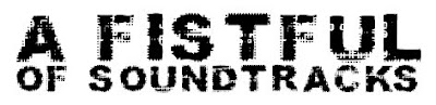
2006 A Fistful of Soundtracks logo
2006-2009: I was in the mood for a font that crossed Cowboy Bebop with those banjo-scored '70s Sesame Street "sand letter" interstitials.

2009 A Fistful of Soundtracks logo
2009-?: I wanted a return to the station name's spaghetti western roots because some people still don't understand that the name's a reference to Morricone's classic collabos with Leone.

The best result of the Morricone/Leone partnership was Once Upon a Time in the West, one of my favorite flicks since high school (I first saw it letterboxed and uncut on Bravo, back when the channel was actually watchable and wasn't a dumpster for irritating reality shows and Criminal Intent reruns). OUATITW was unique for having Morricone finish recording the score before filming began so that Leone could play it aloud on the set to help get the actors into character and to synchronize camera movements to the tempo of the music.

The 1968 epic is a still-misunderstood film (here's a reason why I don't like the city I live in and can't wait to leave it: when I rewatched OUATITW in a local theater, everyone there gradually walked out until I was the only one left because these downtown assclowns who were clearly raised on Michael Bay were expecting a shoot-'em-up, and that's not what the film is, though it contains a couple of kickass action sequences, particularly the Jason Robards shootout on the train). OUATITW is also a great union of music and image, and because the score was completed before a single frame of film was shot, it's very listenable outside the context of the movie, which is why I frequently played it on my college radio program and then on my Internet radio station.

I'm glad someone suggested A Fistful of Soundtracks as the title of my program in 1997 because Once Upon a Time in Soundtracks doesn't roll off the tongue as easily.

Friday, 19 June 2009

"I Need to Score" T-shirt by Shelf Life

The Deuce's PopeyePete linked in a recent tweet to a bunch of ill exploitation cinema-related T-shirts by the Cleveland-based Shelf Life Clothing. Here's the illest of them all:

Finally a film music T-shirt that doesn't look dorky.

These are the legendary film music composers whose faces are on the shirt:

Love the shirt, but where's Elmer Bernstein?

Shelf Life's shirt design for their film music tee is way better than the shirt design I came up with for my CafePress store a long time ago:

Coming soon: a 'Horner Recycles' shirt.

'Morricone Rocks' T-shirt by Jimmy J. Aquino

In a hipster T-shirt market with too many racist companies and not enough Blacklavas, it's nice to see Shelf Life defy the market and be pro-Asian for a change:

'No Dogs and Chinese Allowed' was a musical number deleted from Snoopy Come Home.

I like that this Bruce Lee shirt's got the same colors as his Game of Death tracksuit. They ought to make panties in those Game of Death colors too because that would be a dope gift for my girlfriend.

Tuesday, 9 June 2009

The Warriors by Tom Whalen: He'll shove his pencil up your ass and turn you into a Popsicle

Graphic designer Tom Whalen created a nifty alternate poster for The Warriors, one of my favorite flicks from the '70s (it's hard to believe its badass synthesizer score, which every hip-hop DJ or cratedigger will tell you has got breaks galore, was written by the same composer who was involved with the not-so-Warriors-like "Nadia's Theme"):

Can you dig it?
The Warriors' controversial, poorly received original poster was a menacing-looking portrait of all the gangs from the film. Moviegoers wouldn't be this frightened by a one-sheet again until 2007, when a shirtless, Jim Morrison-spoofing John C. Reilly scared away 90 percent of Walk Hard: The Dewey Cox Story's target audience.

Here's another Whalen-designed alternate poster I like:

I'd like to see a new alternate poster for THE SHINNING.
I think Whalen's poster is creepier than the official Shining poster designed by the legendary Saul Bass in 1980. Somewhere, a Bass fan who's following me on Twitter will read this and proceed to unfollow me.

Thursday, 28 May 2009

Minority Militant "Project X" T-shirt design sketches

The Minority Militant, a Chicago blogger who's a fan of my webcomic The Palace, recently asked me to design a T-shirt for his Project X fund, which he'll use to "reward any independent film director or producer with an outstanding treatment that casts at least one lead role for an Asian American male or female."

Check out the evolution of my Project X shirt design.

Project X T-shirt design by Jimmy J. Aquino, phase 1
Project X T-shirt design by Jimmy J. Aquino, phase 2
Project X T-shirt design by Jimmy J. Aquino, phase 3
Project X T-shirt design by Jimmy J. Aquino, phase 4
Project X T-shirt design by Jimmy J. Aquino, phase 5
Because Project X is about supporting Asian American cinema, I originally wanted to draw an image of the Minority Militant literally kicking the backside of a white actor who's in yellowface and dressed up as the very dated Charlie Chan, whom Hollywood studios keep threatening to revive every few years (last failed attempt: that time when 20th Century Fox tried to get Lucy Liu to star as Chan's granddaughter). The image of Chan with a foot in his ass had stemmed from an idea I've had for a teaser trailer for the Asian American private eye movie or TV series I always wanted to create, in case it would ever get greenlit. The trailer, which would be a sendup of Chan movies, would show a white actor as a Chan-esque character who's trying to reveal the killer in a roomful of suspects, but before the Chan-esque detective can finish his corny, Confucius quotation-laden summation, he gets run over by a car driven by the movie's real hero, whom the trailer announcer would describe as not being "the same old Asian detective played by a guy who's as Asian as a Dutch clog dancer."

I told TMM my initial concept for the Project X drawing, and he joked that he's non-violent, which gave me an idea for the pose that became part of the tee's final design. I based TMM's pose on the famous 1964 "By Any Means Necessary" photo of an armed Malcolm X peering through window curtains, which an Uzi-wielding KRS-One memorably imitated on the cover of Boogie Down Productions' By All Means Necessary album. But instead of a rifle or an Uzi, TMM is holding his preferred weapon, his blog, which is represented by a laptop.

Malcolm XBDP's By All Means Necessary cover